06 / 06
Sunrise
A ship that can't afford to forget
Designing a living archive that notices when a generation ship is starting to forget, and helps its crew relearn before it matters.
A shared archive tracks which critical topics nobody has opened in a while. When a topic starts to fade, it sends a sensory cue to crew devices and invites them to a five-minute refresher quiz. Three testing rounds drove two iterations of both the dashboard and the app.
The brief
A ship that can't afford to forget
Hyperion asked us to explore how knowledge can be sustained across every generation of a generation ship: a closed, self-sustaining spacecraft whose journey outlasts any single human life. The people who arrive are the descendants of the people who left.
On a ship travelling for 250 years, people born on board have never seen Earth. Critical knowledge is passed on by word of mouth, gets distorted, and disappears when the people who hold it retire or die. Forgetting how to manually override a water purifier or handle an electrical fire isn’t an inconvenience. It can threaten the survival of everyone on board.
Our goal was a learning system that keeps essential knowledge alive in a way that is accessible and fair to everyone, whatever their role or background.
My role
In our team of three, we didn’t split into fixed roles: all three of us worked as UX researchers through every phase together. From desk research and personas, the ethical lens and the design principles, through brainstorming and choosing a concept, to wireframes, prototypes, three rounds of testing and the iterations that followed.
The process
Choosing the right problem
Desk research surfaced three themes worth pursuing on a generation ship: entertainment and sport (how do you move your body in an enclosed space?), health and wellness (mental health over a lifetime in confinement) and knowledge and education. We chose knowledge because it is the one where failure is silent: nobody notices a gap until the moment it’s needed.
We then named three outcomes the solution had to support: anticipating problems before they become disasters, equity so everyone has the same access to knowledge, and quality so what gets stored stays accurate and reliable.
How might we provide continuous learning opportunities, minding equity, for all people born on the ship?
Before generating ideas we compared five ethical frameworks (virtue, deontology, consequentialism, contract and care) and shortlisted three:
- Deontology, rejected: duties and universal rules leave little room for personal circumstances, which clashed with our focus on accessibility and equity.
- Contract, rejected: a fair distribution of responsibilities, but it treats people as participants in a system rather than focusing on their needs and vulnerabilities.
- Care, chosen: it centres relationships, empathy and attentiveness to others’ needs. On the ship, preserving knowledge is about survival and also about caring for the wellbeing of future generations.
Three people born on the ship
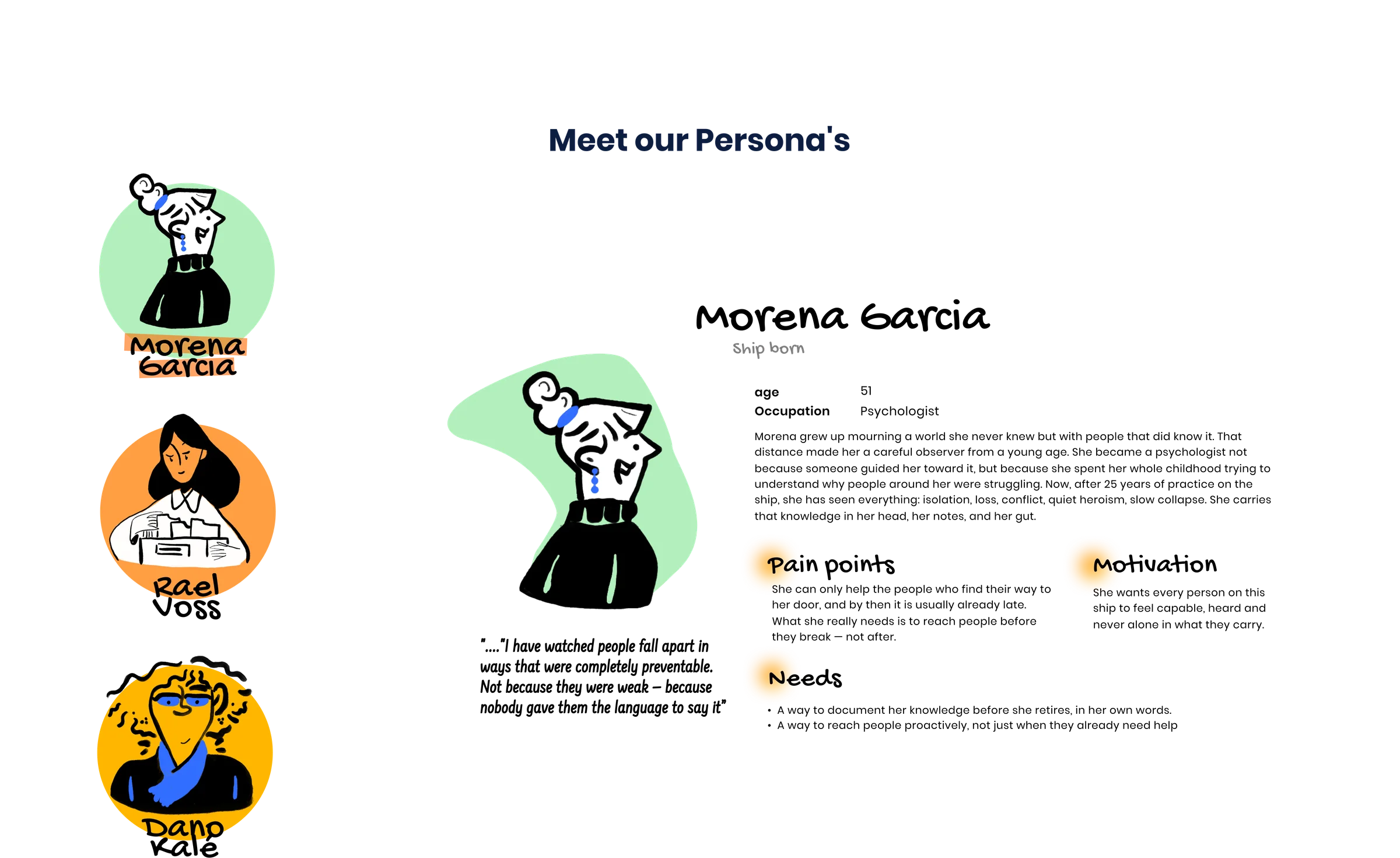
We built personas for people who have never seen Earth, each with a different relationship to knowledge: someone who holds it, someone who lacks it, and someone who adapted it.
- Morena Garcia, 51, psychologist: “I have watched people fall apart in ways that were completely preventable.” She only reaches people once they come to her door, usually too late, and needs to document her knowledge before she retires.
- Rael Voss, 21, not yet assigned: “I don’t always know which parts of what I learned actually apply here.” Gaps only show up when something goes wrong. She needs a clear sense of what she knows versus what she still needs to learn.
- Dano Kalé, 41, sanitation & waste: “The Earth-born taught me everything, but half of it needed fixing for here.” The next generation will have nobody Earth-born to learn from. He needs his adapted knowledge valued, and ways to share it without writing it all down.
Across all three, the problem wasn’t access to information. Knowledge lives in people, people leave, and nobody can tell what they’ve forgotten until an emergency exposes it.
Two learning theorists shaped how we responded. Paulo Freire argues that education should empower people instead of passively transferring knowledge from authority figures. Lev Vygotsky shows that learning happens best just beyond your current ability, with support from others. Together they pushed us away from a static manual and toward something active and social.
Principles that took three drafts
We wanted principles concrete enough to settle arguments later. Getting there took three iterations and two rounds of feedback from our coaches.
- Draft 1, from secondary research: five topics (holistic skills, equality, freedom of speech, accessibility, qualitative education). Feedback: too many, too overlapping. Pick three.
- Draft 2, merged to three: holistic skills, qualitative education, accessibility. Feedback: titles too vague, the why behind each was missing, and the differences between them were unclear.
- Final, three principles:
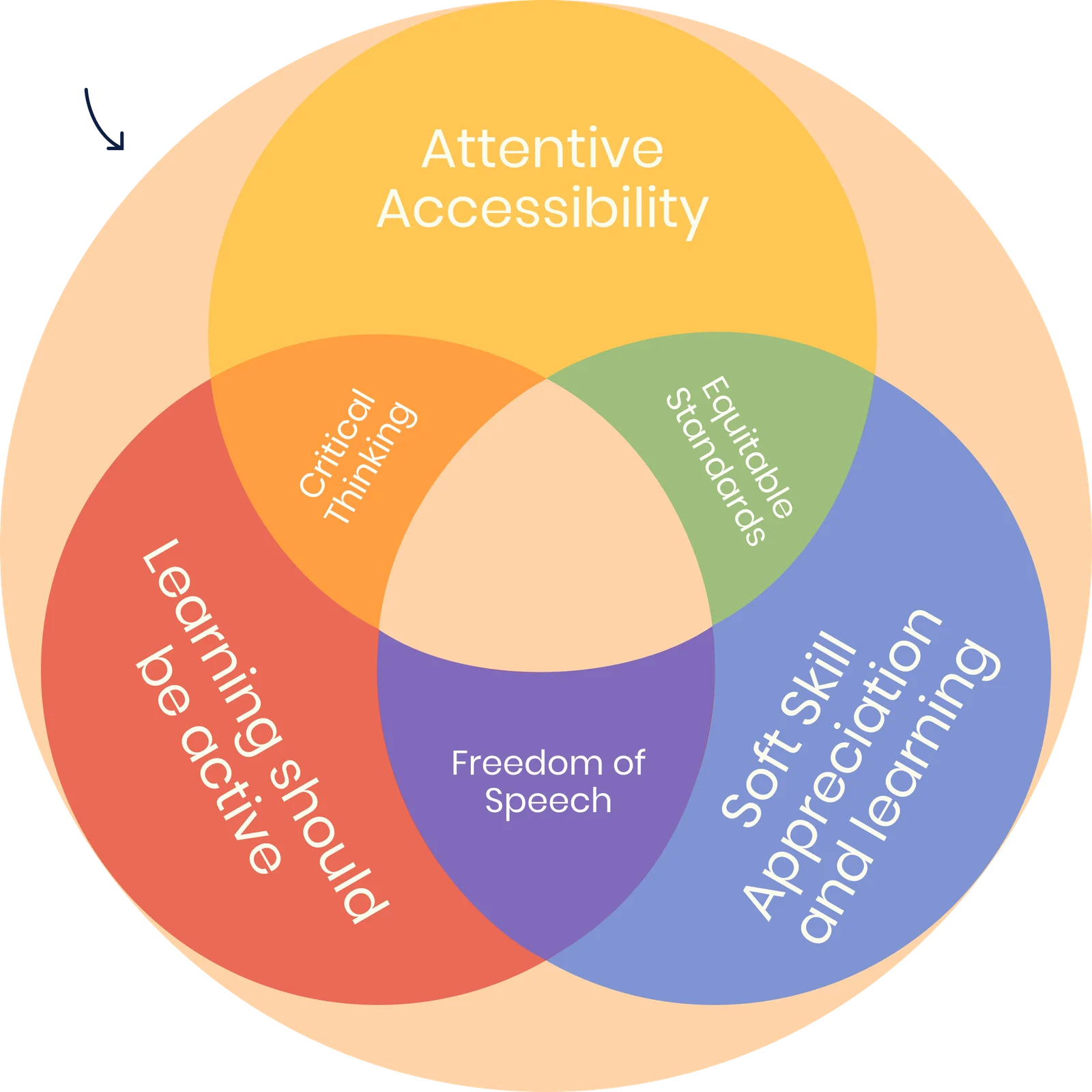
- Attentive accessibility. If someone can’t access education, the problem is the system, not the person.
- Learning should be active. People learn by doing and reflecting, not by receiving.
- Soft-skill appreciation. Emotional, creative and ethical skills count as much as technical ones.
Where they overlap: critical thinking, equitable standards and freedom of speech.
Diverge wide, then converge on purpose
Each of us ran two techniques, so we came at the problem from six angles:
- To diverge: Inversion brainstorm, Bias brainstorm, Random word association and Chili Sin Carne.
- To converge: a COCD box and Six Thinking Hats.
Three of them shaped the final idea most:
- Inversion: we designed the worst education system first: authoritarian, exclusive, learning as a privilege. Flipping it gave us a collaborative, lifelong system woven into daily ship life.
- Bias brainstorm, curse of knowledge: experts forget what it’s like not to know. On the ship, critical knowledge is assumed, not taught, which became the core reason the system must actively check what people know.
- Random word, “coral reef”: fragile, endangered, an ecosystem. Thinking of knowledge as endangered led to a device that flags a “species” of knowledge that’s dying out.
We pooled every idea into a COCD box, voted on the ideas that best answered our HMW and clustered them into three concepts: a skill sensor + test, an immersive Earth course and a living ship archive. We stress-tested each with a different method (Six Thinking Hats, Speedboat, SWOT and Rose, Bud, Thorn).
Decision: drop the Earth course and merge the other two. A convincing immersive experience didn’t fit our timeframe, and its emotional risks conflicted with attentive accessibility. The sensor and the archive covered each other’s weaknesses: the archive gives the quiz a source of truth, and the quiz stops the archive from becoming a graveyard nobody opens.
How Sunrise works
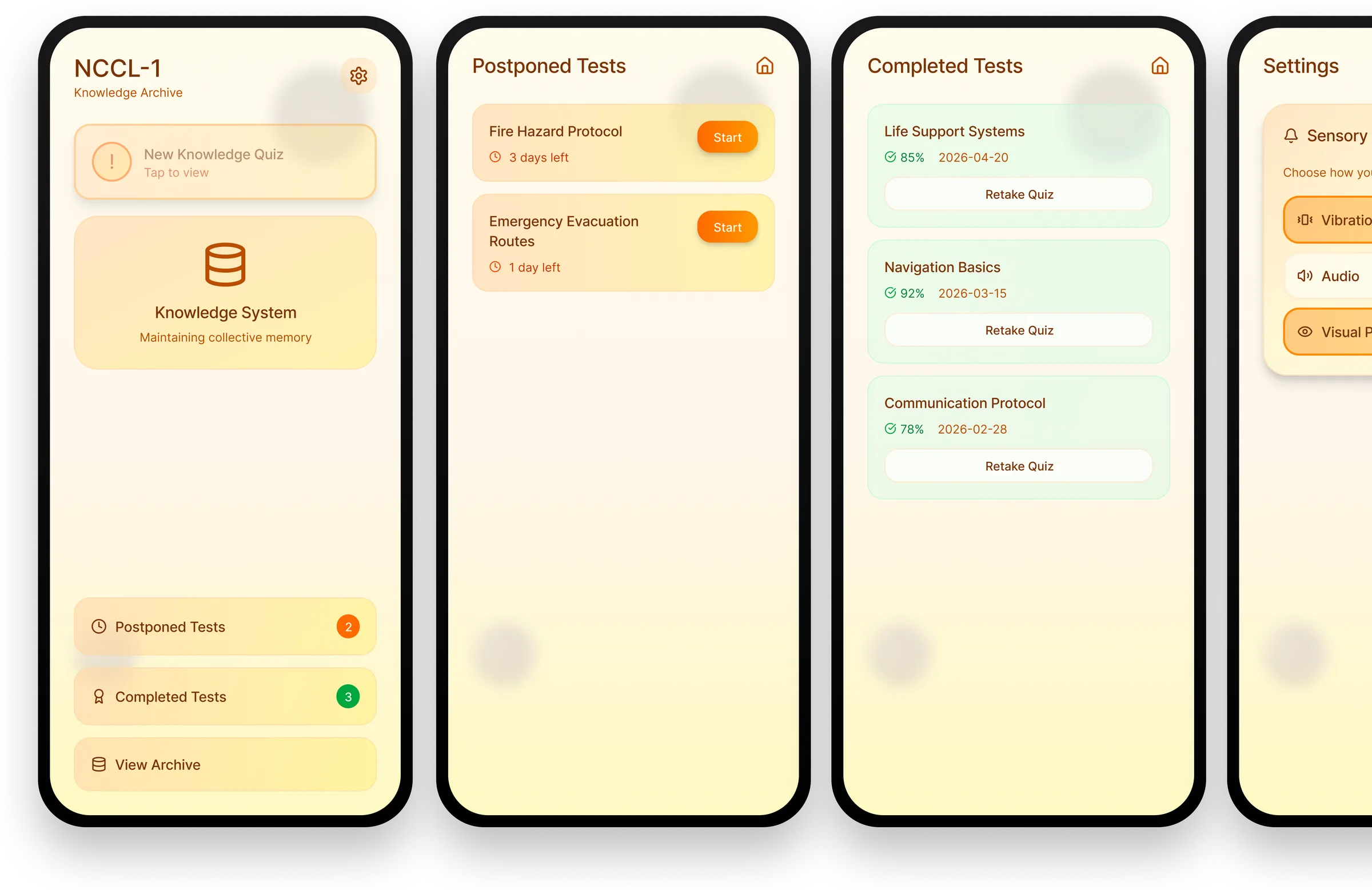
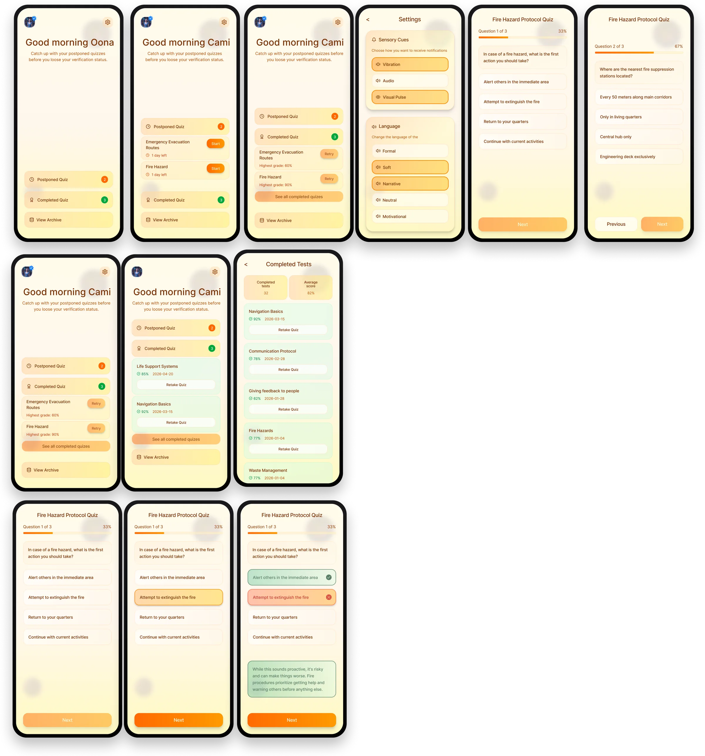
Anyone on board can add knowledge, experiences and improvements to the archive. The archive tracks which topics marked as critical are still being opened. When one goes untouched too long, it sends a sensory cue (vibration, sound or a visual pulse, chosen by each person) to crew devices. People take a five-minute refresher. If they don’t know the answers, the app sends them back to the archive to relearn, and they can add what they know.
The journey map exposed the riskiest moment: the gap, when someone fails a test about something they were supposed to know. Much of our later design work (tone of voice, feedback after every answer, framing results as a shared responsibility rather than a personal failure) was about making that dip shallower.
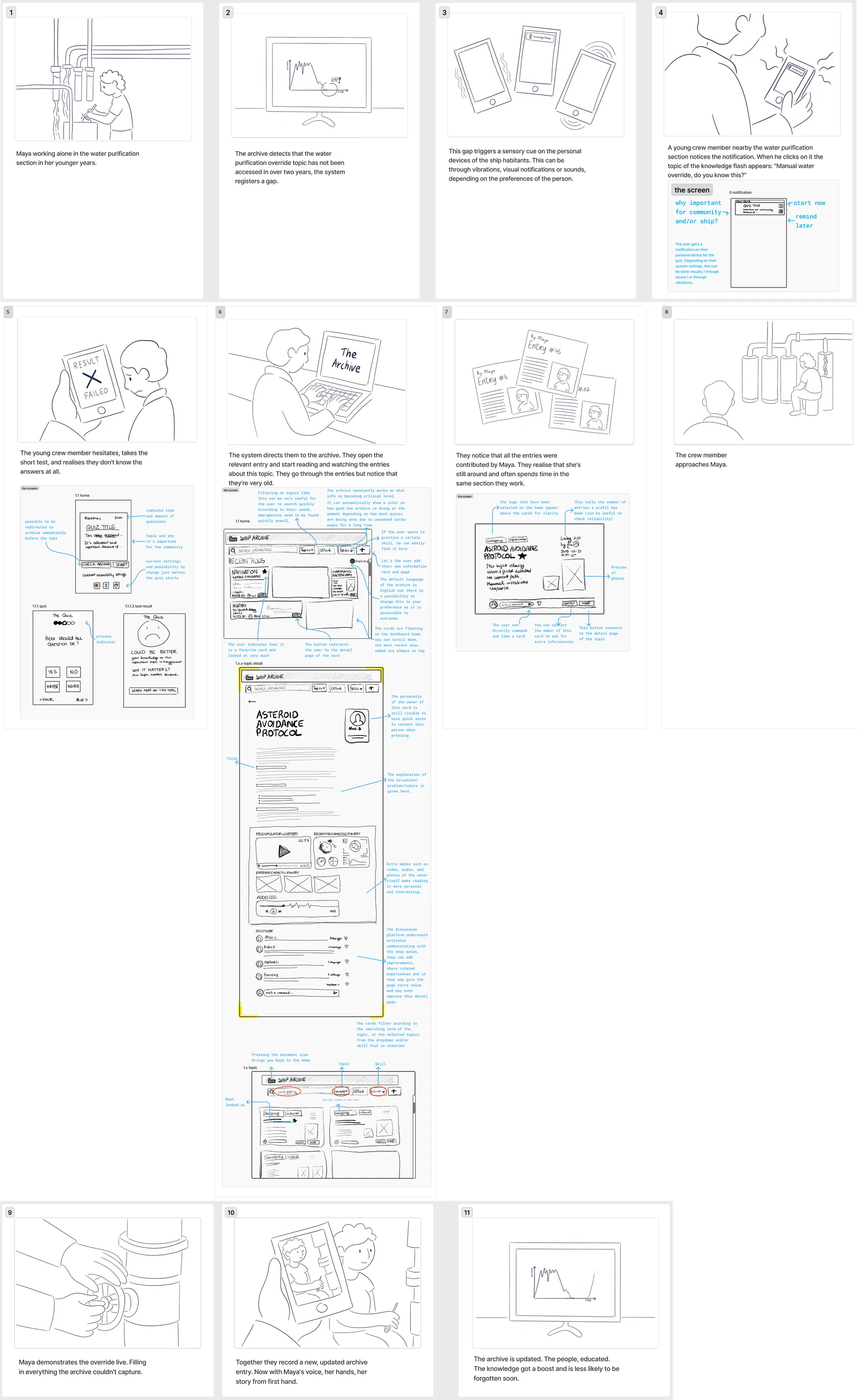
Storyboard: the archive notices nobody has opened the manual water-override topic in over two years. A young crew member gets the cue, takes the test and realises he doesn’t know the answers. The entries are old and all written by Maya, 74, who still works in his section. She demonstrates the override live, and together they record a new entry in her voice.
Goals, flows and architecture
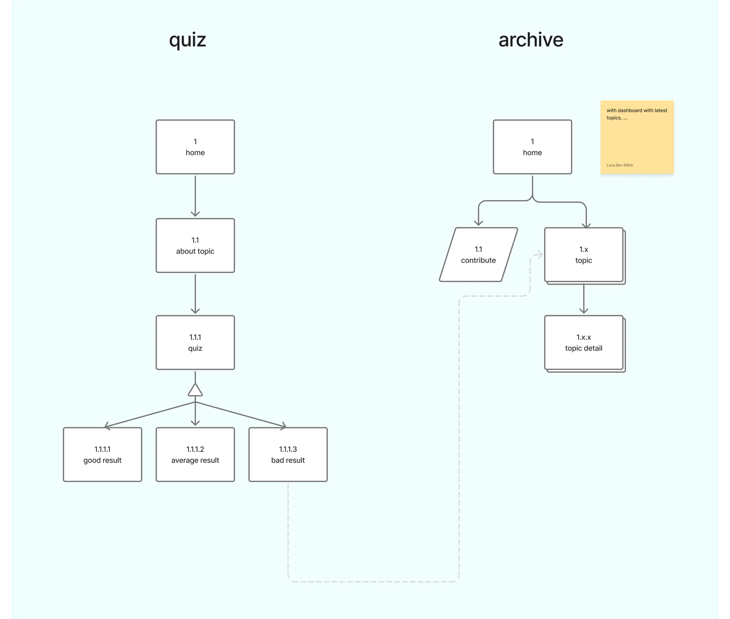
We split goals into individual (feel capable, be heard, not be embarrassed or left behind) and community (keep the mission alive, fix gaps fast, stay ready for emergencies). Every flow had to serve both.
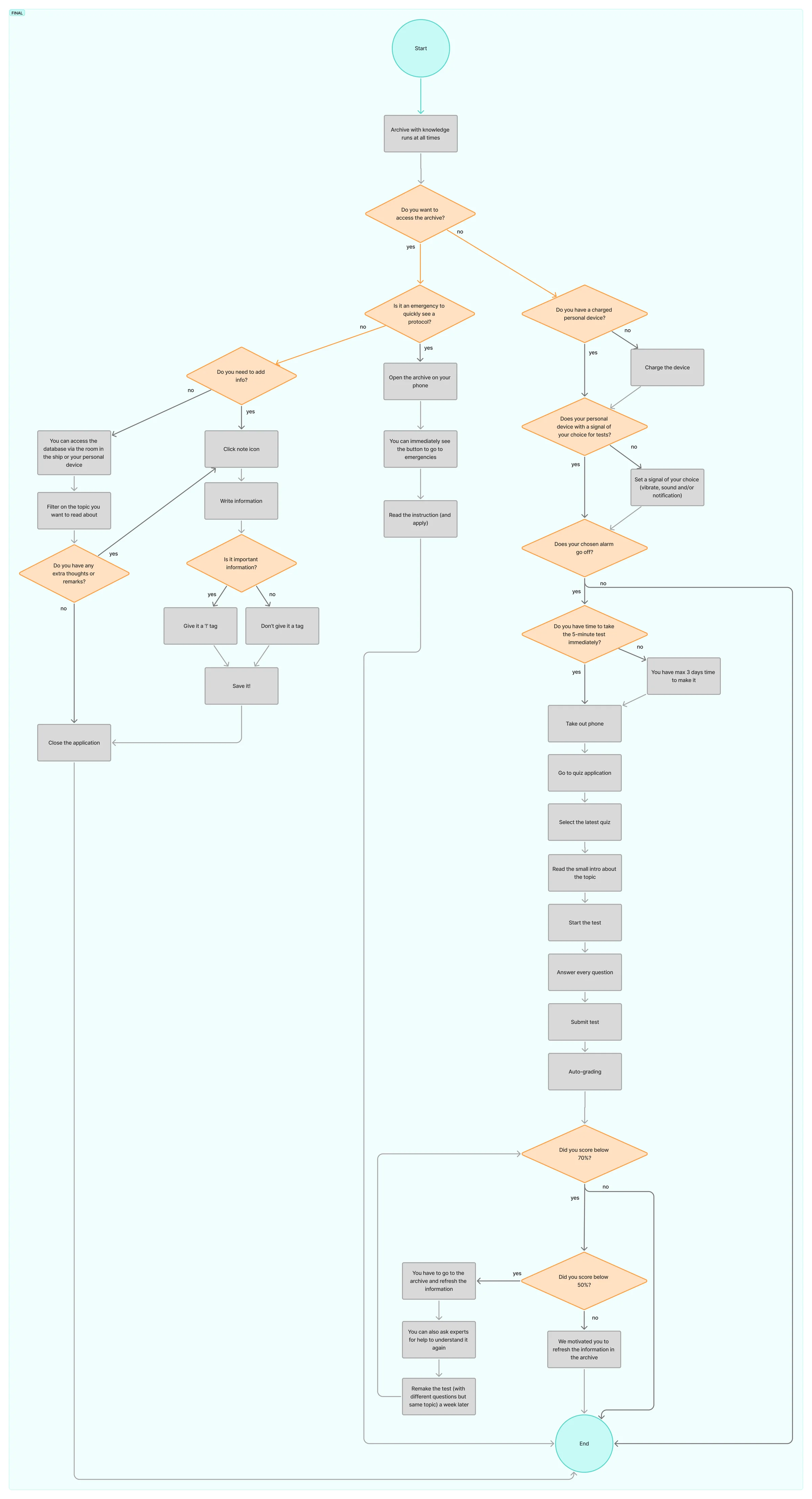
The everyday contribution flow we settled on after several iterations: someone learns a trick or fix → opens the archive → fills in a short form (title, type, tags, media) → previews and saves → gets linked topics → others discover and reuse it.
Messy sketches first
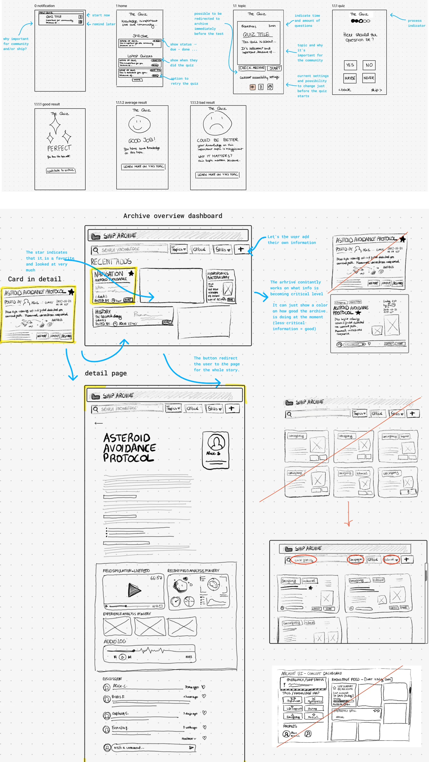
Our first wireframes were rough on purpose. We annotated them heavily so we could argue about features rather than pixels: a star for favourite entries, a colour showing how “healthy” the archive’s knowledge is, a short time estimate so the test feels manageable, and accessibility settings right before the quiz starts. We scrapped an early grid layout for the archive because every card looked equally important.
An experiment with AI prototyping. We generated dashboard and quiz prototypes with Stitch and Lovable. The results looked polished: dark sci-fi consoles, telemetry, countdown warnings, “initiate purge” buttons. From a user’s point of view they were overwhelming. High-pressure language worked against attentive accessibility, and dense dashboards worked against active learning. They were useful as a quick first look, but we went back to designing our own screens in Figma, guided by the principles and by testing.
Testing a system nobody can live in yet
Our users don’t exist yet, and neither does the ship. That ruled out several standard methods, so we chose deliberately:
- Used: Wizard of Oz (to fake the sensor, notifications and device behaviour), eye tracking (where attention actually goes) and Buy a Feature (what testers really prioritise).
- Ruled out: reliability testing (you can’t test 200 years), guerrilla testing (the ship context needs too much explanation), online tools, The Mom Test (nobody has real-life experience of this world) and fake doors.
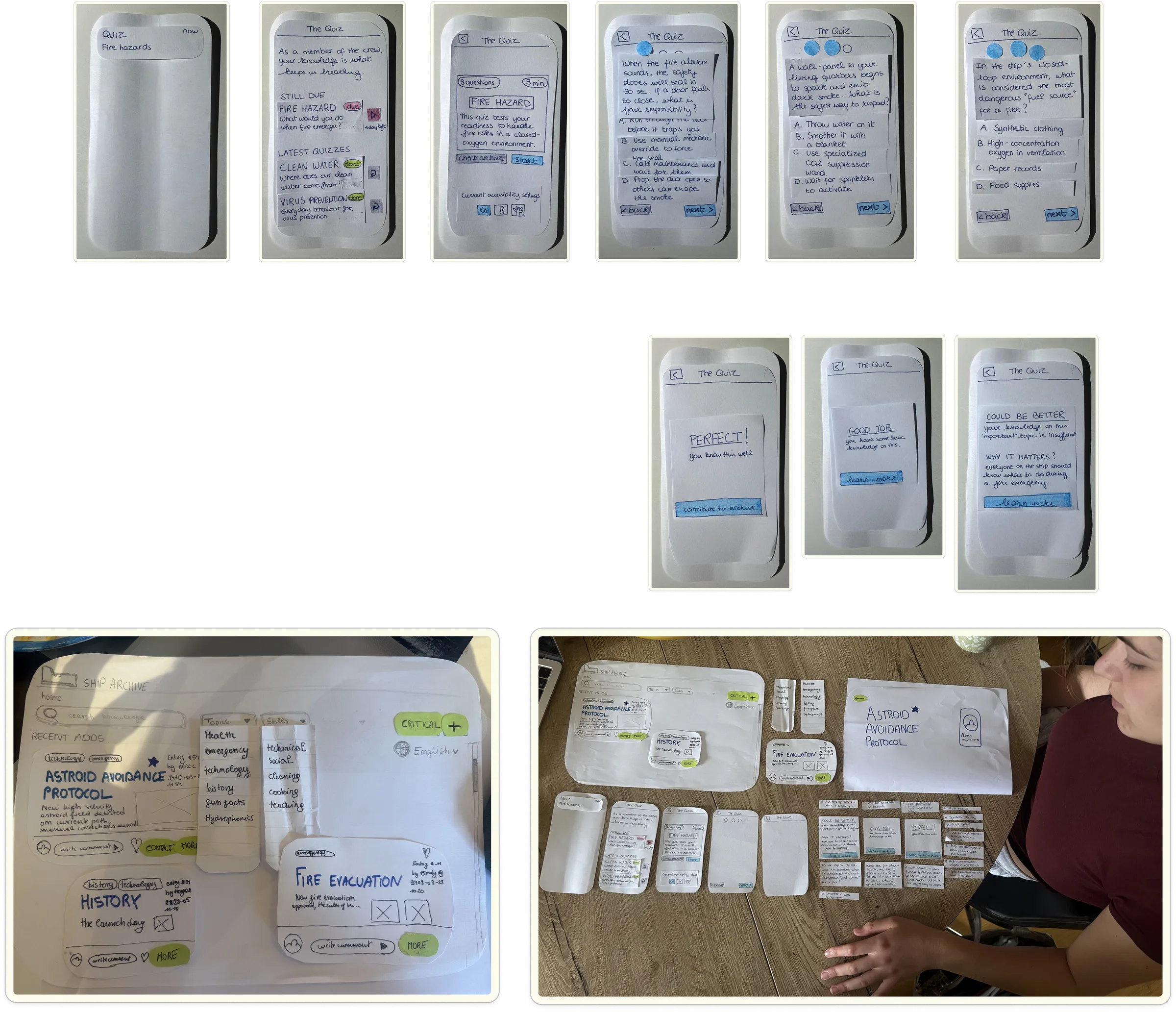
We wrote eight tasks, each with an explicit success and failure signal, and dropped two: one tested a “lockdown” that stopped people leaving a test, which conflicted with our principles. Testers played a nurse born on the ship, working through one scripted scenario from setting their sensory cue to “buying” the features they valued most.
- Buy a Feature, with classmates: surfaced confusion about the basics and concerns about who can edit the archive.
- Wizard of Oz, paper: one tester at a time, logged in a per-tester dashboard and merged into a combined summary.
- Wizard of Oz, digital + eye tracking: Figma prototypes with heatmaps and fixation order per screen, focused on hierarchy, clarity and findability.
Every round had five testers: fifteen test sessions in total.
What testing changed
Each finding maps to a change in the next iteration.
Archive dashboard
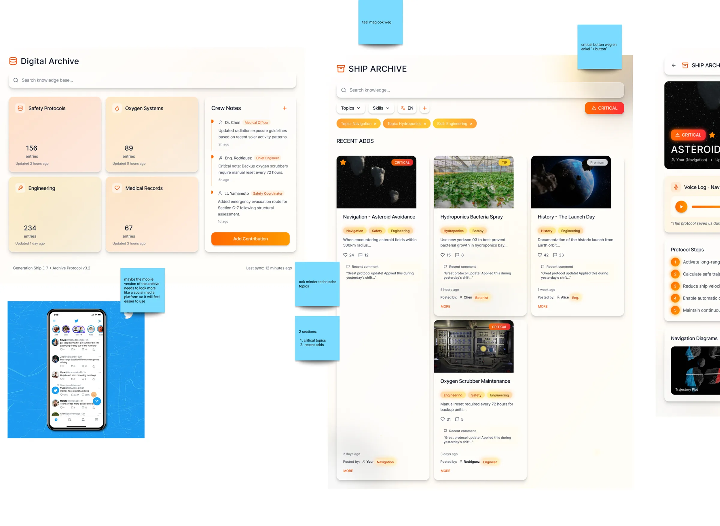
- Settings and icons were confusing → repositioned settings, clearer iconography, language switch moved out of the main view.
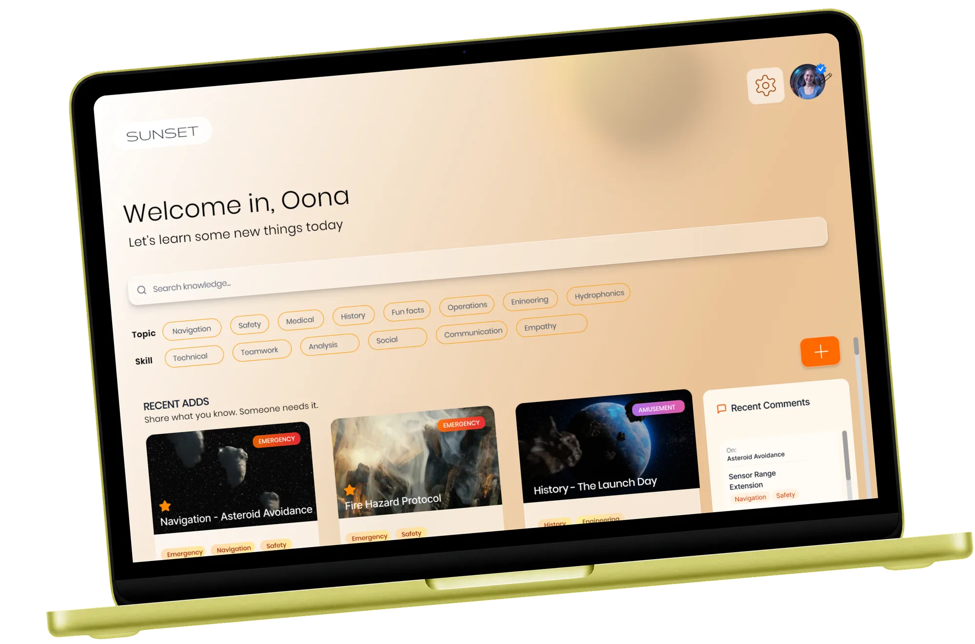
- The “critical” button wasn’t understood → a single, clear “+” button for adding knowledge.
- Walking to a separate archive room to add something felt like too much effort → contribute directly from any entry’s detail page.
- Concern that anyone could add anything → voting on helpful comments and independent review instead of deletion.
- No sense of what to rehearse next → home split into critical topics and recent adds; crew can vote on topics to rehearse.
Quiz app
- Postponing a test took too many steps → a postpone button in the notification itself.
- No feedback until the end of the quiz → immediate feedback after every answer.
- “1 day left” didn’t feel urgent → state the consequence: you’ll lose your verification status.
- One tone of voice didn’t suit everyone → choose formal, soft, neutral, motivating or narrative messaging.
- Testers saw a technical tool and missed the emotional stakes → Oona’s story, to show why forgetting matters.
The final result
The final prototypes
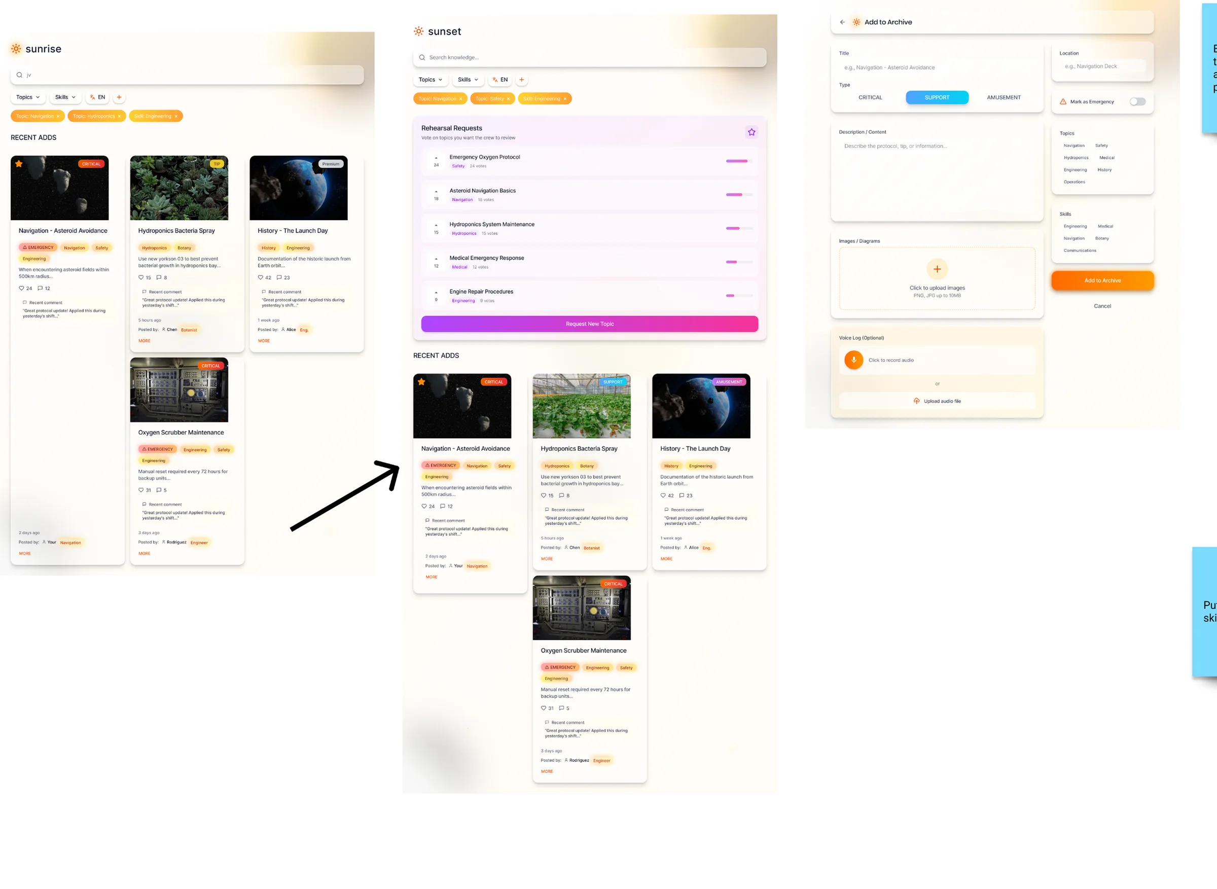
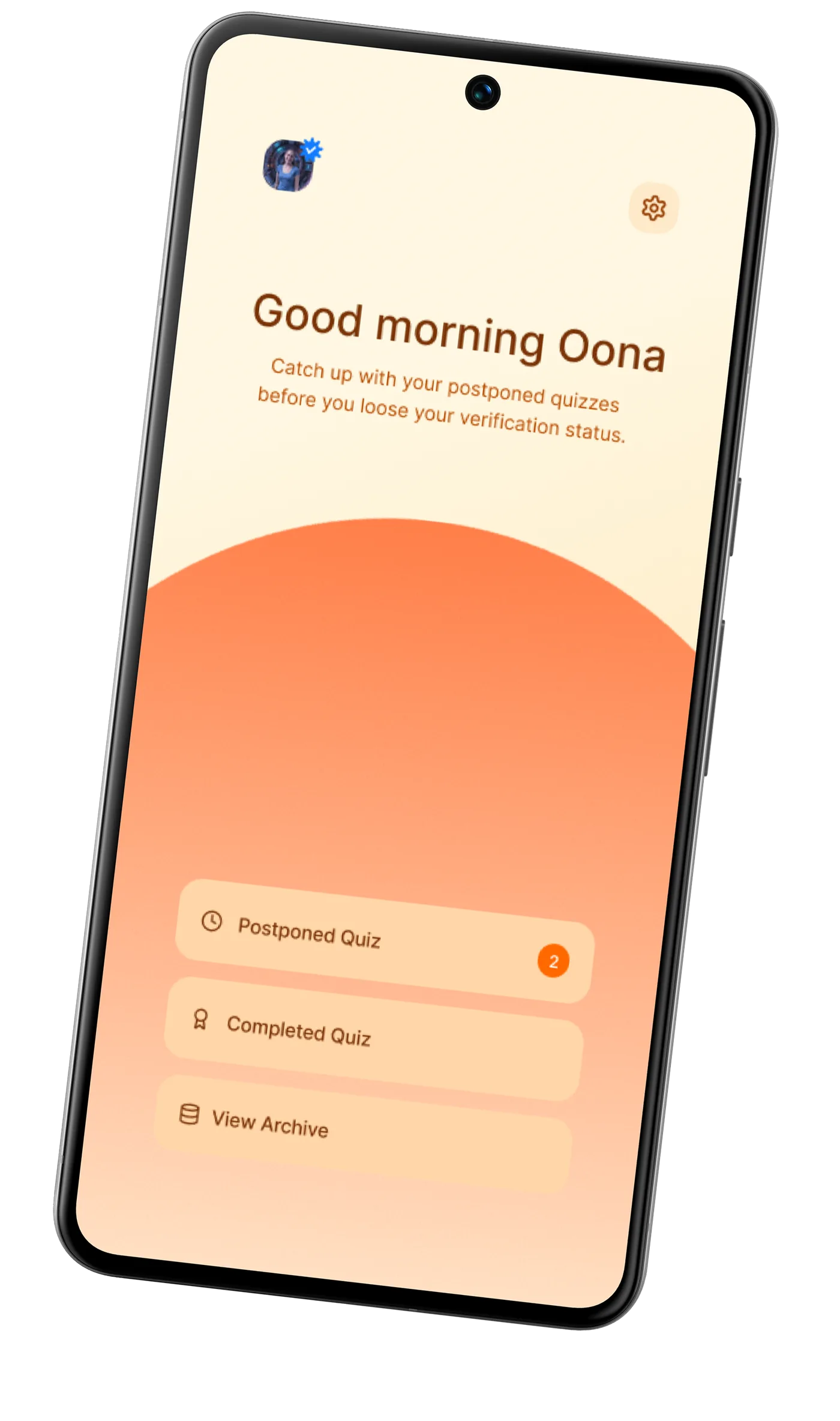
Two connected products: an archive dashboard where crew browse, search and contribute knowledge, and a personal-device app that delivers cues, refresher quizzes and results, with sensory and tone preferences each person controls.
Conclusion
Sunrise grew from a broad, speculative brief into a concrete system that keeps the knowledge of entire generations alive in space. It doesn’t just store information: it keeps it alive by getting people to learn, remember and share their experiences and stories together. Accessibility, active learning, sensory cues and collective responsibility come together in one connected experience that supports both personal growth and the long-term survival of the ship.
The road there mattered as much as the result. At the start, the concept felt too broad and abstract to turn into realistic interactions, and that struggle pushed us to think harder about what people would actually need. We kept questioning our ideas, tested and adapted them based on feedback, and kept coming back to our design principles and the theory from class.
The hardest part was predicting how people will behave in a future nobody has lived in. That’s why we walked every tester through the scenario in depth before they started. There were many iterations, discussions and uncertain moments, but whenever one path was blocked, we looked for another.