
02 / 06
Miles & Meals
A world of flavours in every box.
Miles & Meals brings the energy of street food culture into your home kitchen.
I developed the brand identity around discovery, connection and elevated authenticity — combining vibrant colours, bold typography, hand-drawn illustrations and raw, in-the-moment photography.
The result is a brand that feels like travelling without leaving your kitchen.
The brief
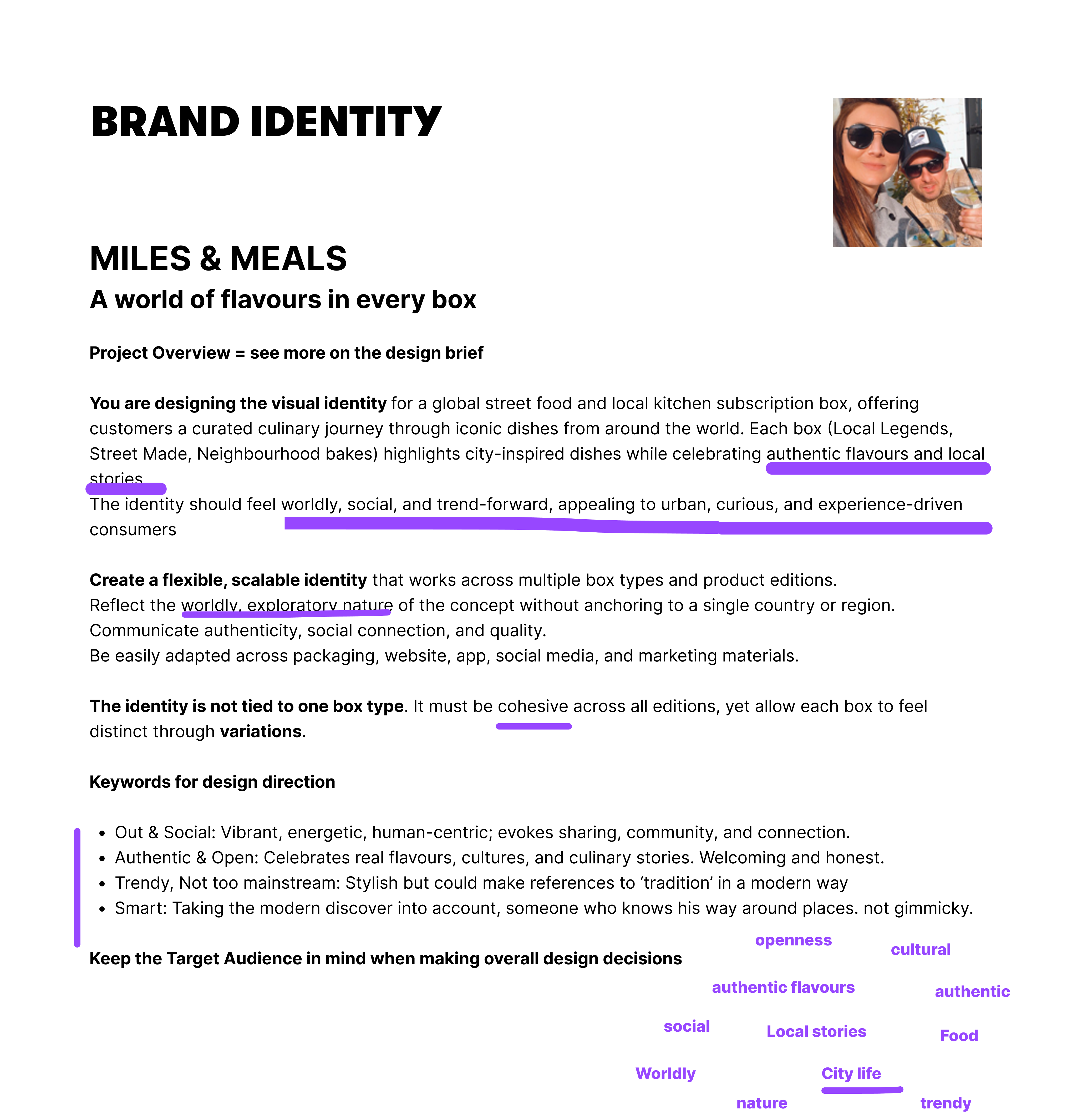
For this project, I was tasked with designing the full visual identity and mobile app for Miles & Meals. It is a subscription service delivering authentic street food straight to customers’ kitchens, focusing on the dishes locals actually eat, from tacos al pastor in Mexico City to bánh mì in Vietnam.
My role was to define how the brand looks, feels, and communicates through the logo, colour, typography, tone of voice, and photography direction.
The curious foodie
Miles & Meals is for the curious foodie: someone who’d rather eat where the locals queue than from a tourist menu, and who loves discovering a city through its food.
They’re social and always on the go, so they want real, surprising flavours at home without spending the whole evening in the kitchen. And they care about quality: it has to feel special, not like just another meal kit.
The process
The idea
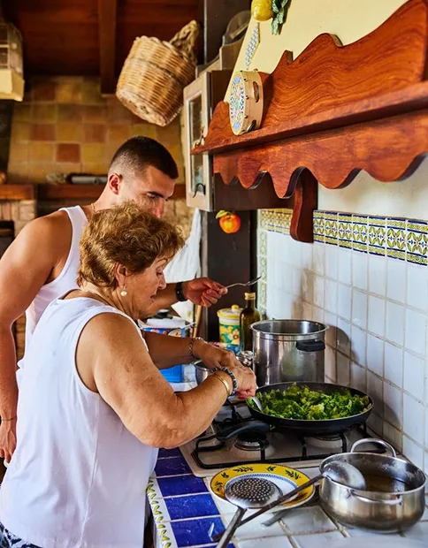
What if dinner could take you somewhere? Miles & Meals turns authentic street food and local stories into an at-home experience. Each box explores a city, neighbourhood or food culture through one signature dish.
The atmosphere I was after: real kitchens, recipes passed on through generations, cooking together. No tourist traps, no generic meal kits.
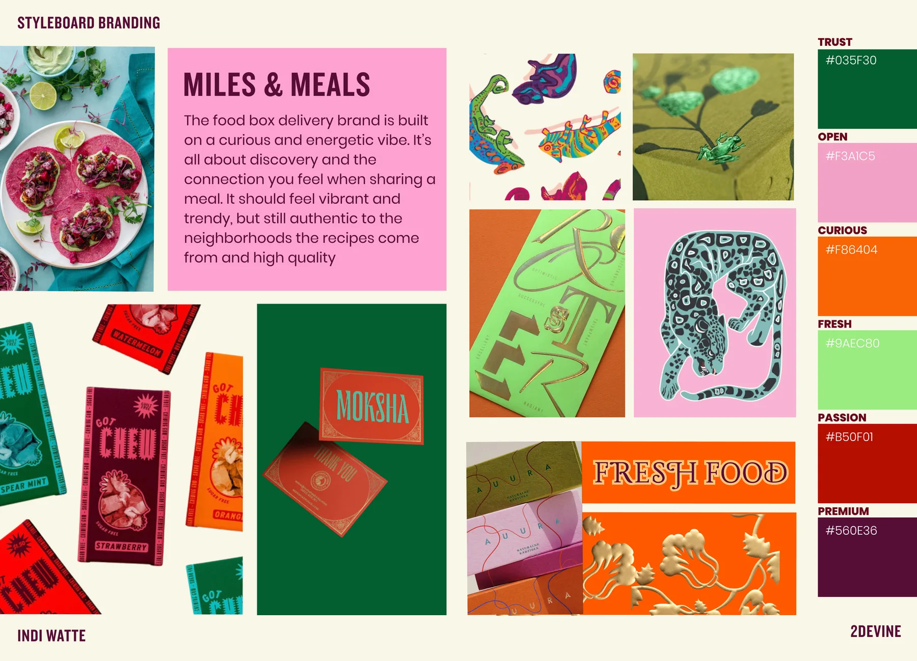
Personality
Before designing anything, I defined who the brand is: curious & energetic, vibrant, trendy, authentic & open. Its values are discovery, quality and connection, and it speaks in an outgoing, social tone.
The tricky balance: it has to feel premium without becoming polished, and authentic without becoming cliché.
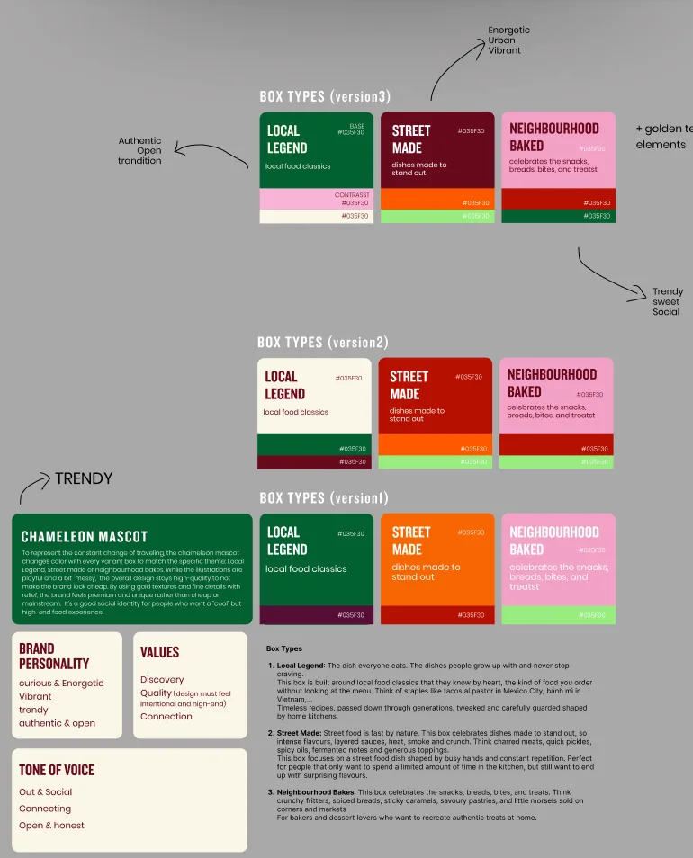
Colours
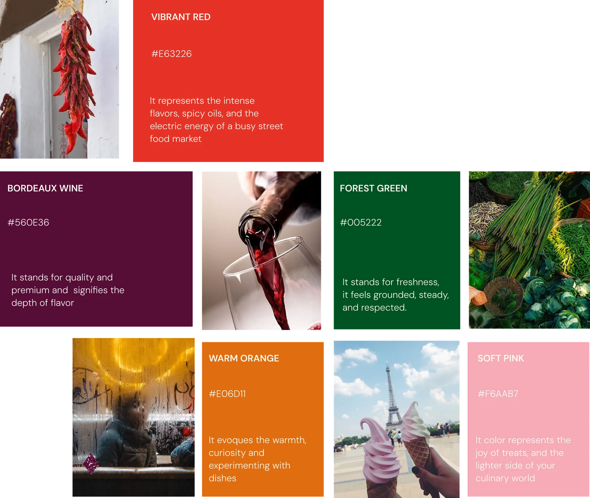
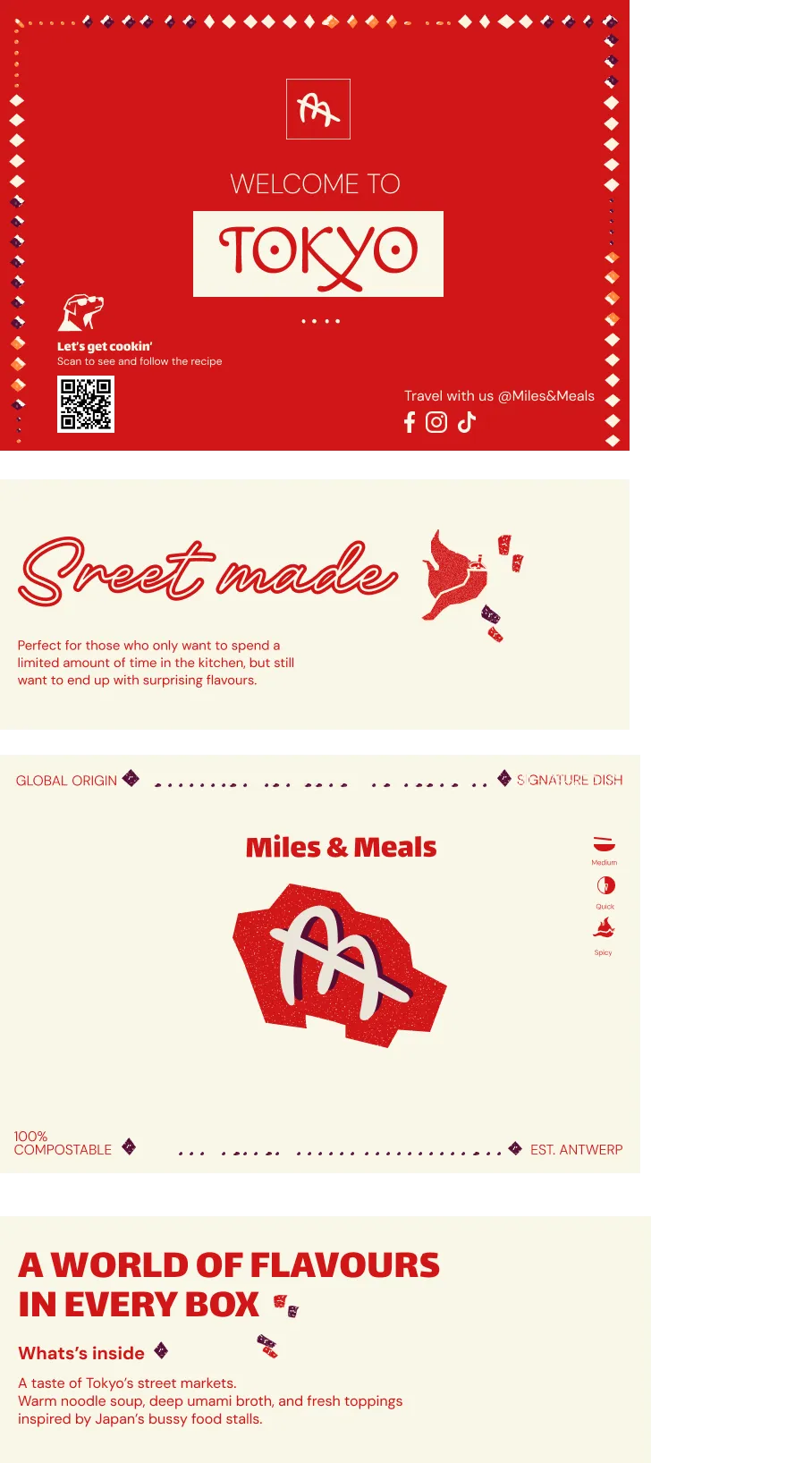
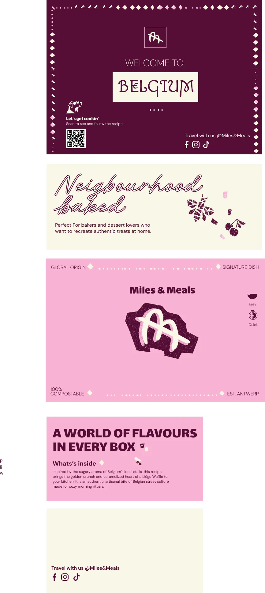
Every colour got a job. Vibrant red for the intense flavours and the energy of a busy market, bordeaux for quality and depth of flavour, forest green for freshness, warm orange for curiosity and soft pink for the joy of treats.
The palette bridges the organic and the urban: earthy tones from raw ingredients, paired with the colour of city life. Each box got its own combination, and it took three rounds before every box had its own character while the three still clearly belong together.
Patterns
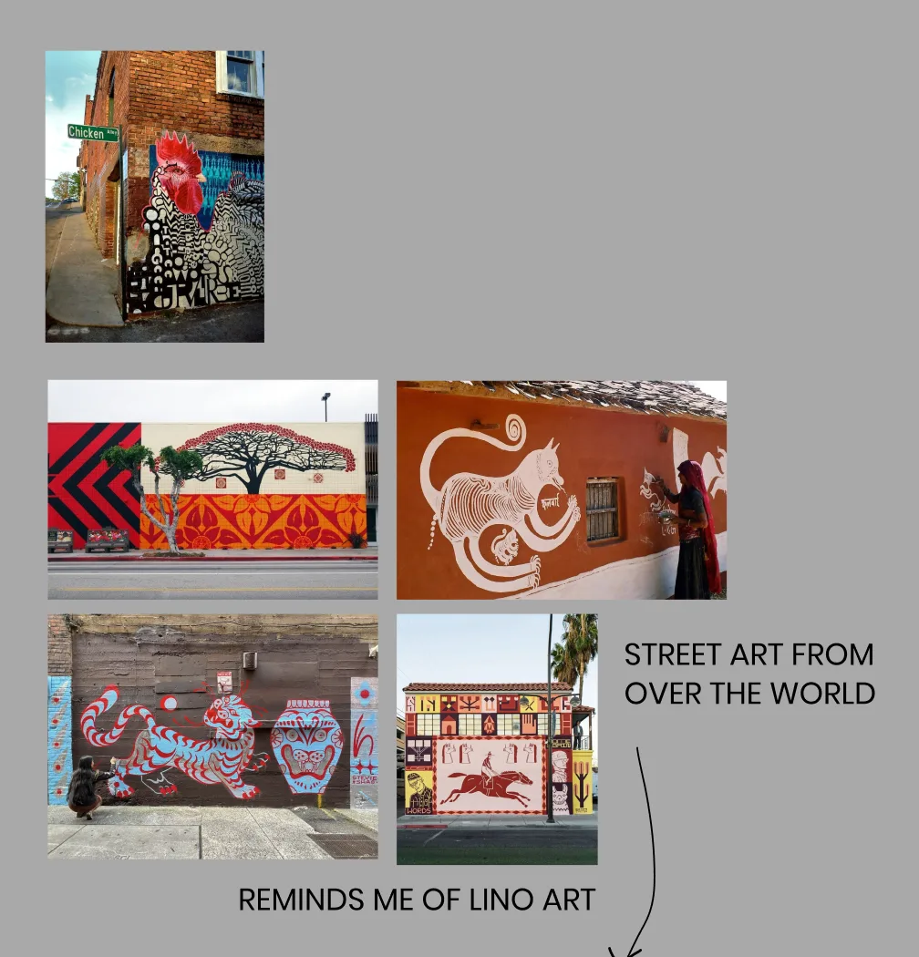
For the patterns I looked at street art from all over the world: murals in bold, flat shapes that reminded me of lino prints, a little rough and clearly made by hand.
The pattern itself comes from the mosaics and tiles you see on city squares and buildings everywhere you travel. On the boxes, the little mosaic shapes look like flavours spreading out.
From animals to symbols
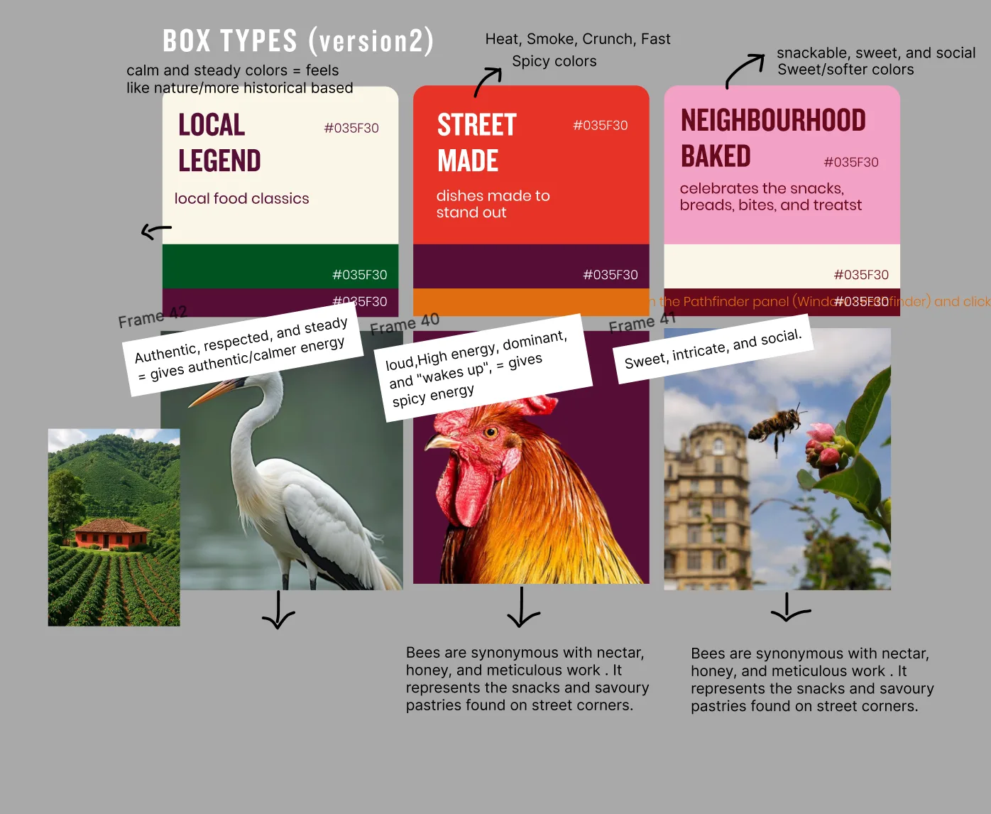
My first idea was an animal per box: a calm, respected heron for Local Legend, a loud rooster that wakes everyone up for Street Made, and a bee for Neighbourhood Bakes.
In the end I kept the bee, and found stronger symbols for the other two: the humble plastic chair for Local Legend, the ultimate symbol of authenticity and memory, and the chili for Street Made, with all the heat, smoke and energy of the night market.
Building the identity
Logo & typography
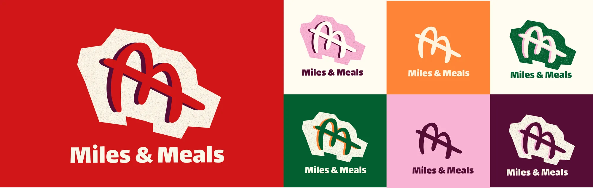
The logo blends a hand-drawn, street-art mark with clean typography. Its diagonal stroke does two things at once: it stands for being on the way, and it’s a chopstick, linking travel to taste straight away.
Lalezar gives the titles their bold weight, balanced by a handwritten font. DM Sans keeps the body text clean and readable, and every city gets its name in Macondo, a raw typeface that gives each destination its own sense of place.
Illustrations & icons
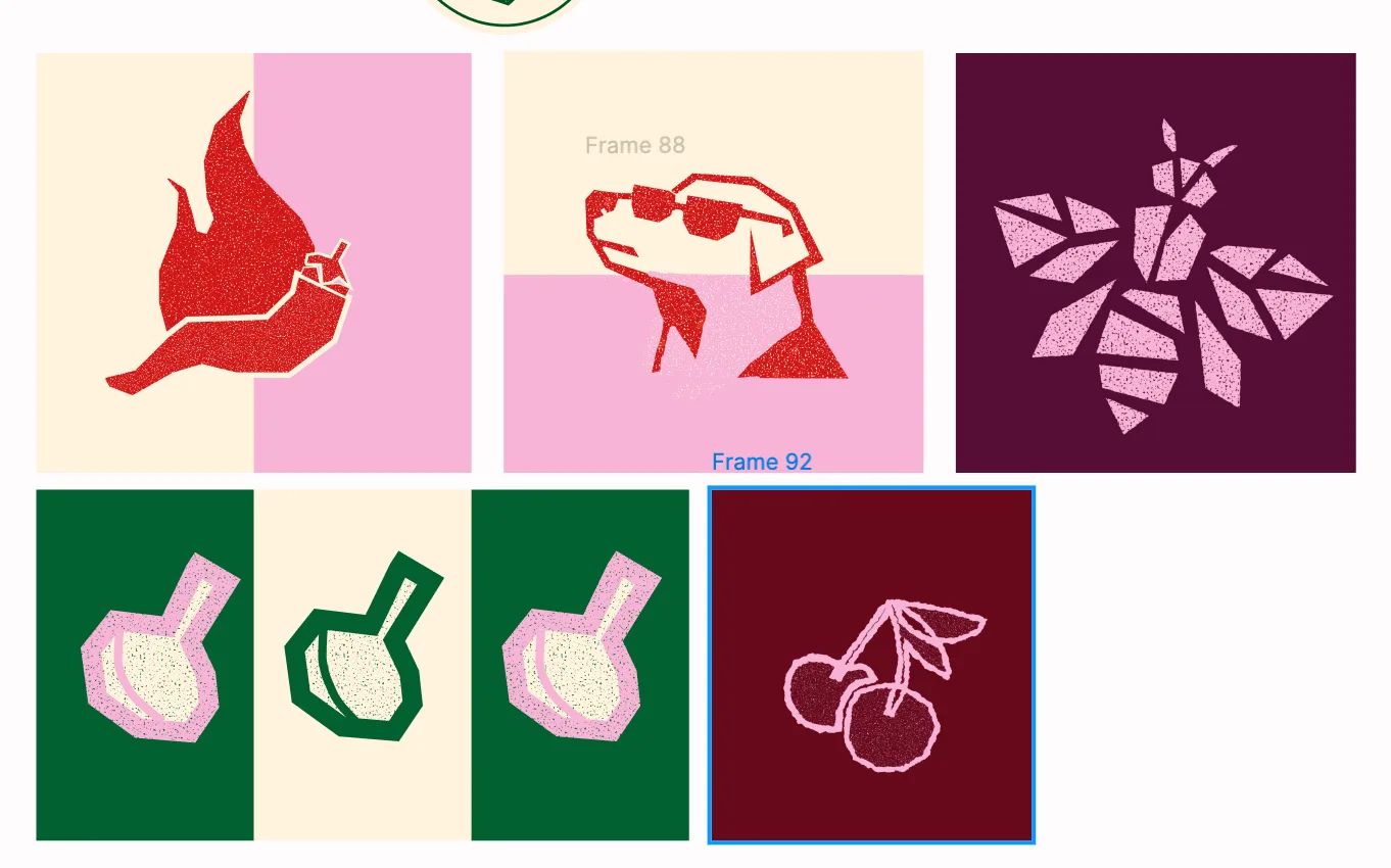
The illustrations have a grainy, lino-like texture, like the street art they come from. Next to the three box symbols, extra illustrations (garlic, cherries, a bottle) can be combined with photos on socials.
Small icons on the boxes show how long a dish takes, how hard it is and how spicy, so someone on the go can plan their time at a glance.
The boxes
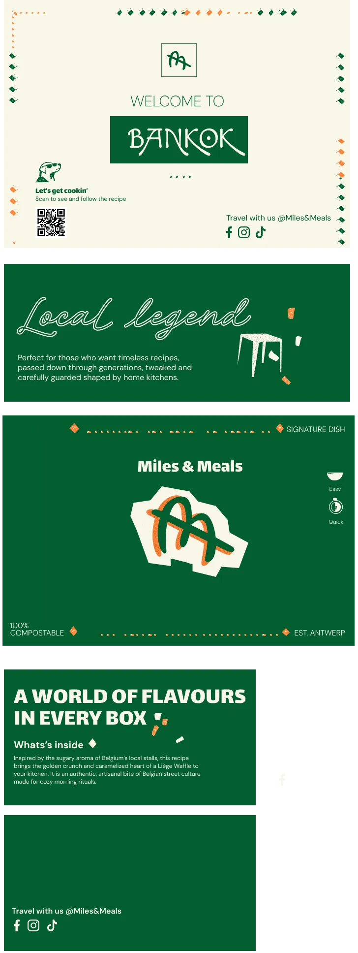
One brand, three personalities. Each box uses its own colours and symbol to show its flavour at a glance: Local Legend for the classics everyone grows up with, Street Made for dishes made to stand out and Neighbourhood Bakes for snacks and sweet treats.
Inside, a QR code connects the box to the app and the socials.
Beyond the box
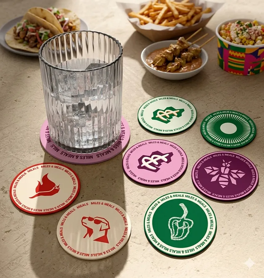
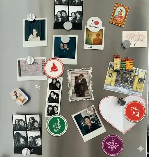
The experience doesn’t stop when the box is empty. Coasters and magnets bring the brand into the kitchen every day, and they’re small souvenirs of the trip you made at home.
Final result
The brandboard
Everything comes together in the brandboard: logo, brand vision, illustrations, colours, pattern, typography, icons, the boxes, photography and the extras.
A box of ingredients. A whole world to discover.

Reflection
What I learned: Branding goes much further than a logo and colours. It’s about positioning the brand and solving its problem: the strategy and the design have to go hand in hand, so that every visual choice tells the same story.